
Install
preact-markup 

A <Markup> component that renders HTML (or XML) using Virtual DOM, mapping a set of element names to Components. Works beautifully with Preact.
Think of this like an HTML5 renderer where Web Components are implemented as Preact Components.
:zap: JSFiddle Demo :zap:
Use Cases
- Rendering Markdown in VDOM - see preact-markdown
- Component-base app design and/or layout via HTML
- Define app structure using a standard HTML CMS
- Support arbitrary component extensions by allowing safe HTML
- Build using Custom Elements, implemented using React's API
Overview
The <Markup /> component takes some markup, an optional mapping of custom element names to components, and an optional type of either xml or html.
In it's simplest form, <Markup /> is just a diffing XML/HTML renderer. It only re-renders when you change the markup prop.
 import Markup from 'preact-markup';

let html = `<h1>hello</h1> <p>Testing 1 2 3...</p>`;
render(<Markup markup={html} />, document.body);
Note: by default, content is parsed as XML, which may be too strict for your content but is the fastest option. Pass
type="html"to parse as HTML.
Custom Elements via Components
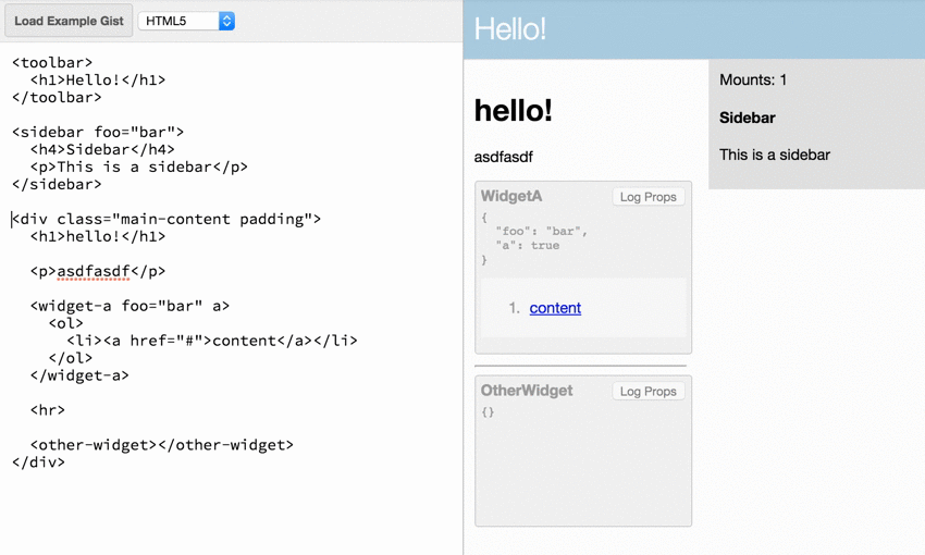
The real value of <Markup /> is seen when passing a components prop. This prop is an Object that lets us map any HTML/XML element name to a preact Component. The mapped component is injected and rendered as if it had been referenced from within JSX. HTML attributes defined on the custom element in markup get passed to the mapped Component as props.
 import Markup from 'preact-markup';

const Sidebar = ({ title, children }) => (
	<aside class="sidebar">
		<h2>{ title }</h2>
		{ children }
	</aside>
);

let html = `
<h1>Hello, World</h1>
<sidebar title="My Sidebar!">
	<p>Sidebar contents.</p>
</sidebar>
`;
render(<Markup markup={html} components={{ Sidebar }} />, document.body);
When render() is invoked, Our <Sidebar /> component is substituted for the <sidebar> element, which means it gets mounted and rendered like a normal Preact Component. The result is this HTML DOM:
 <div class="markup">
	<h1>Hello, World</h1>
	<aside class="sidebar">
		<h2>My Sidebar!</h2>
		<p>Sidebar contents.</p>
	</aside>
</div>
Subsequent render()s diff against that DOM just like a normal JSX rendering flow would.
Optional properties
type - By default, content is parsed as XML. Pass type="html" to use an HTML parser.
trim - Trimming tries to emulate HTML semantics by default, but these differ from JSX semantics. Pass false to retain all whitespace, or all to omit all whitespace.
onError - Suppress XML/HTML parse errors and instead pass them to this function.
allow-scripts - By default, preact-markup sanitizes the rendered HTML by removing script tags. The allow-scripts property re-enables script tags, executing any JavaScript code within them.
Example
 let markup = `<em>hello!</em><h1>asdflkj</h1><script>alert("Hello world");</script>`;
render(<Markup markup={markup} allow-scripts />, document.body);