Install
Tooltip & Popover Positioning Engine

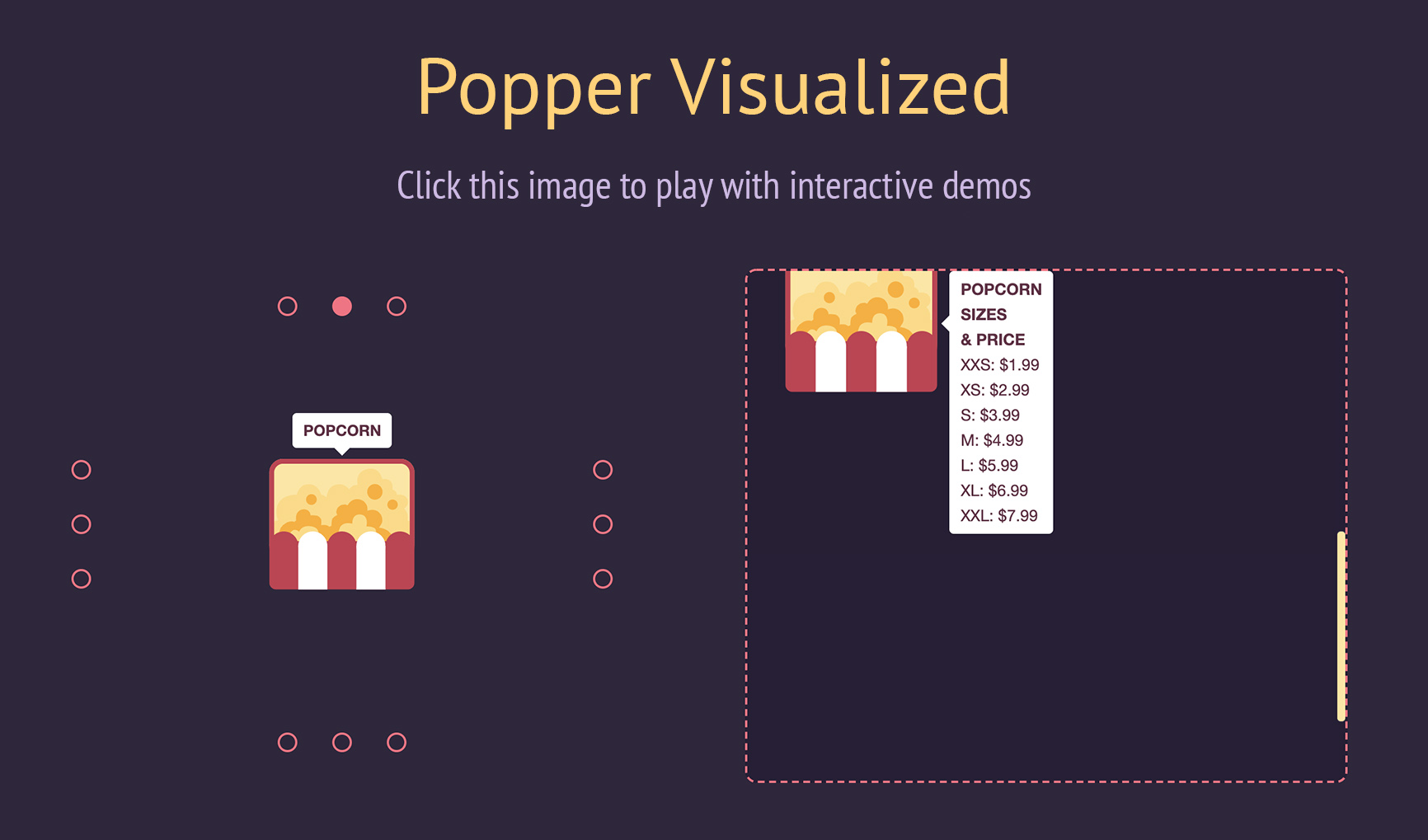
Positioning tooltips and popovers is difficult. Popper is here to help!
Given an element, such as a button, and a tooltip element describing it, Popper
will automatically put the tooltip in the right place near the button.
It will position any UI element that "pops out" from the flow of your document
and floats near a target element. The most common example is a tooltip, but it
also includes popovers, drop-downs, and more. All of these can be generically
described as a "popper" element.
Demo
Docs
We've created a
Migration Guide to help you
migrate from Popper 1 to Popper 2.
To contribute to the Popper website and documentation, please visit the
dedicated repository.
Why not use pure CSS?
- Clipping and overflow issues: Pure CSS poppers will not be prevented from
overflowing clipping boundaries, such as the viewport. It will get partially
cut off or overflows if it's near the edge since there is no dynamic
positioning logic. When using Popper, your popper will always be positioned in
the right place without needing manual adjustments. - No flipping: CSS poppers will not flip to a different placement to fit
better in view if necessary. While you can manually adjust for the main axis
overflow, this feature cannot be achieved via CSS alone. Popper automatically
flips the tooltip to make it fit in view as best as possible for the user. - No virtual positioning: CSS poppers cannot follow the mouse cursor or be
used as a context menu. Popper allows you to position your tooltip relative to
any coordinates you desire. - Slower development cycle: When pure CSS is used to position popper
elements, the lack of dynamic positioning means they must be carefully placed
to consider overflow on all screen sizes. In reusable component libraries,
this means a developer can't just add the component anywhere on the page,
because these issues need to be considered and adjusted for every time. With
Popper, you can place your elements anywhere and they will be positioned
correctly, without needing to consider different screen sizes, layouts, etc.
This massively speeds up development time because this work is automatically
offloaded to Popper. - Lack of extensibility: CSS poppers cannot be easily extended to fit any
arbitrary use case you may need to adjust for. Popper is built with
extensibility in mind.
Why Popper?
With the CSS drawbacks out of the way, we now move on to Popper in the
JavaScript space itself.
Naive JavaScript tooltip implementations usually have the following problems:
- Scrolling containers: They don't ensure the tooltip stays with the
reference element while scrolling when inside any number of scrolling
containers. - DOM context: They often require the tooltip move outside of its original
DOM context because they don't handleoffsetParentcontexts. - Compatibility: Popper handles an incredible number of edge cases regarding
different browsers and environments (mobile viewports, RTL, scrollbars enabled
or disabled, etc.). Popper is a popular and well-maintained library, so you
can be confident positioning will work for your users on any device. - Configurability: They often lack advanced configurability to suit any
possible use case. - Size: They are usually relatively large in size, or require an ancient
jQuery dependency. - Performance: They often have runtime performance issues and update the
tooltip position too slowly.
Popper solves all of these key problems in an elegant, performant manner. It
is a lightweight ~3 kB library that aims to provide a reliable and extensible
positioning engine you can use to ensure all your popper elements are positioned
in the right place.
When you start writing your own popper implementation, you'll quickly run into
all of the problems mentioned above. These widgets are incredibly common in our
UIs; we've done the hard work figuring this out so you don't need to spend hours
fixing and handling numerous edge cases that we already ran into while building
the library!
Popper is used in popular libraries like Bootstrap, Foundation, Material UI, and
more. It's likely you've already used popper elements on the web positioned by
Popper at some point in the past few years.
Since we write UIs using powerful abstraction libraries such as React or Angular
nowadays, you'll also be glad to know Popper can fully integrate with them and
be a good citizen together with your other components. Check out react-popper
for the official Popper wrapper for React.
Installation
1. Package Manager
 # With npm
npm i @popperjs/core

# With Yarn
yarn add @popperjs/core
2. CDN
 <!-- Development version -->
<script src="https://unpkg.com/@popperjs/core@2/dist/umd/popper.js"></script>

<!-- Production version -->
<script src="https://unpkg.com/@popperjs/core@2"></script>
3. Direct Download?
Managing dependencies by "directly downloading" them and placing them into your
source code is not recommended for a variety of reasons, including missing out
on feat/fix updates easily. Please use a versioning management system like a CDN
or npm/Yarn.
Usage
The most straightforward way to get started is to import Popper from the unpkg
CDN, which includes all of its features. You can call the Popper.createPopper
constructor to create new popper instances.
Here is a complete example:
 <!DOCTYPE html>
<title>Popper example</title>

<style>
  #tooltip {
    background-color: #333;
    color: white;
    padding: 5px 10px;
    border-radius: 4px;
    font-size: 13px;
  }
</style>

<button id="button" aria-describedby="tooltip">I'm a button</button>
<div id="tooltip" role="tooltip">I'm a tooltip</div>

<script src="https://unpkg.com/@popperjs/core@^2.0.0"></script>
<script>
  const button = document.querySelector('#button');
  const tooltip = document.querySelector('#tooltip');

  // Pass the button, the tooltip, and some options, and Popper will do the
  // magic positioning for you:
  Popper.createPopper(button, tooltip, {
    placement: 'right',
  });
</script>
Visit the tutorial for an example of
how to build your own tooltip from scratch using Popper.
Module bundlers
You can import the createPopper constructor from the fully-featured file:
 import { createPopper } from '@popperjs/core';

const button = document.querySelector('#button');
const tooltip = document.querySelector('#tooltip');

// Pass the button, the tooltip, and some options, and Popper will do the
// magic positioning for you:
createPopper(button, tooltip, {
  placement: 'right',
});
All the modifiers listed in the docs menu will be enabled and "just work", so
you don't need to think about setting Popper up. The size of Popper including
all of its features is about 5 kB minzipped, but it may grow a bit in the
future.
Popper Lite (tree-shaking)
If bundle size is important, you'll want to take advantage of tree-shaking. The
library is built in a modular way to allow to import only the parts you really
need.
import { createPopperLite as createPopper } from '@popperjs/core';
The Lite version includes the most necessary modifiers that will compute the
offsets of the popper, compute and add the positioning styles, and add event
listeners. This is close in bundle size to pure CSS tooltip libraries, and
behaves somewhat similarly.
However, this does not include the features that makes Popper truly useful.
The two most useful modifiers not included in Lite are preventOverflow and
flip:
 import {
  createPopperLite as createPopper,
  preventOverflow,
  flip,
} from '@popperjs/core';

const button = document.querySelector('#button');
const tooltip = document.querySelector('#tooltip');

createPopper(button, tooltip, {
  modifiers: [preventOverflow, flip],
});
As you make more poppers, you may be finding yourself needing other modifiers
provided by the library.
See tree-shaking for more
information.
Distribution targets
Popper is distributed in 3 different versions, in 3 different file formats.
The 3 file formats are:
esm(works withimportsyntax — recommended)umd(works with<script>tags or RequireJS)cjs(works withrequire()syntax)
There are two different esm builds, one for bundler consumers (e.g. webpack,
Rollup, etc..), which is located under /lib, and one for browsers with native
support for ES Modules, under /dist/esm. The only difference within the two,
is that the browser-compatible version doesn't make use of
process.env.NODE_ENV to run development checks.
The 3 versions are:
popper: includes all the modifiers (features) in one file (default);popper-lite: includes only the minimum amount of modifiers to provide the
basic functionality;popper-base: doesn't include any modifier, you must import them separately;
Below you can find the size of each version, minified and compressed with the
Brotli compression algorithm:
Hacking the library
If you want to play with the library, implement new features, fix a bug you
found, or simply experiment with it, this section is for you!
First of all, make sure to have
Yarn installed.
Install the development dependencies:
yarn install
And run the development environment:
yarn dev
Then, simply open one the development server web page:
 # macOS and Linux
open localhost:5000

# Windows
start localhost:5000
From there, you can open any of the examples (.html files) to fiddle with
them.
Now any change you will made to the source code, will be automatically compiled,
you just need to refresh the page.
If the page is not working properly, try to go in "Developer Tools >
Application > Clear storage" and click on "Clear site data".
To run the examples you need a browser with
JavaScript modules via script tag support.
Test Suite
Popper is currently tested with unit tests, and functional tests. Both of them
are run by Jest.
Unit Tests
The unit tests use JSDOM to provide a primitive document object API, they are
used to ensure the utility functions behave as expected in isolation.
Functional Tests
The functional tests run with Puppeteer, to take advantage of a complete browser
environment. They are currently running on Chromium, and Firefox.
You can run them with yarn test:functional. Set the PUPPETEER_BROWSER
environment variable to firefox to run them on the Mozilla browser.
The assertions are written in form of image snapshots, so that it's easy to
assert for the correct Popper behavior without having to write a lot of offsets
comparisons manually.
You can mark a *.test.js file to run in the Puppeteer environment by
prepending a @jest-environment puppeteer JSDoc comment to the interested file.
Here's an example of a basic functional test:
 /**
 * @jest-environment puppeteer
 * @flow
 */
import { screenshot } from '../utils/puppeteer.js';

it('should position the popper on the right', async () => {
  const page = await browser.newPage();
  await page.goto(`${TEST_URL}/basic.html`);

  expect(await screenshot(page)).toMatchImageSnapshot();
});
You can find the complete
jest-puppeteer documentation here,
and the
jest-image-snapshot documentation here.
License
MIT